Bookmark Evaluation
What are CMYK and RGB?
CMYK is a scheme for combining primary pigments. The C stands for cyan (aqua), M
stands for magenta (pink) which
darkens and deepens shadows, Y
stands for yellow; which flattens an
image making it look likes it on more of a greyer scale; opposite to magenta,
and K stands for key tone.
RGB - The RGB colour model is an additive color model in which red, green, and blue light are added together
in various ways to reproduce a broad array of colors.
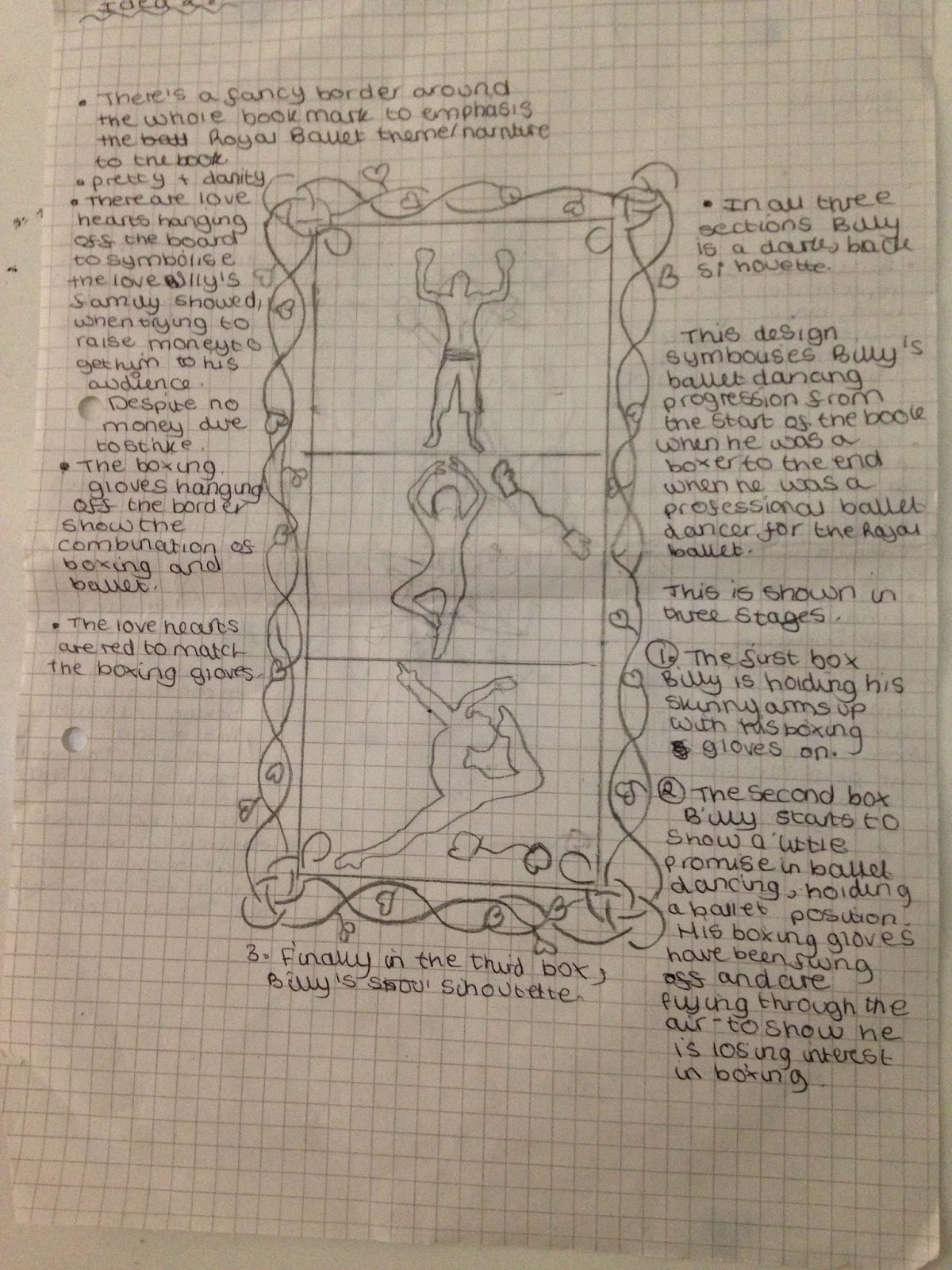
For my assignment I created a bookmark for
the book Billy Elliot. I started off this assignment by drafting different ideas that I could turn into my
final design. The bookmark has a silhouette of one ballet arm and leg and one
boxing glove hand and boxing boot leg coming out the top of the bookmark which
will poke put the book. I feel this is successful as it helps reflect the theme of the book as well as helping bring it too life and make it look more
atheistically pleasing and interesting. I chose design three because I felt it
was most creative and authentic which would stand out against other bookmarks
on the shelf. I decided to use a limited colour plate for my design but the
colours I used were bold and bright with a high contrast. I decided it would be
most effective to use two main colours; red and black with a hint of grey. This colour choice was successful for my design
because it draws attention to the black silhouette in the background making it
stand out and look more effective against the bright, block red front of the
bookmark. By sticking too two main colours it looks more professional and less
messy also helping the text look more vivid. I used a grey colour on the ballet
shoe to emphasise the detail of the ballet laces, using a black colour
disguised the shoe laces to much, therefore using grey helped show what the
shoe was and helped show the comparison of ballet shoe and boxing boot.
With regards to the use of typeface for my design I hand drew the
lettering which writes the title “Billy Elliot” a typeface that is similar to ‘Kunstler
Script’. I felt by using this type of font for the text reflected the theme of
the book well because this style of writing looks fancy and sophisticated,
mirroring the writing on a traditional Royal Ballet ticket giving the reader a
bit of context of what the book might be about before they read anything. It
also gives the bookmark a touch of class and elegance. I chose to just use text
on the main front cover of the bookmark, apart from the silhouette coming out
the edges of it. I thought this was effective because it helped draw attention
to the silhouette and make it look more dramatic and intriguing to the reader.
So by keeping the rest of it plain and simple helped emphasised that. The scale
of the writing took up most of the bookmark and I centralised the title to
reflect that Billy’s feeling had always been pushed to the side and not really
thought about, but by the end he is the centre of attention when he takes
centre stage, the position of the text reflects this.
I feel the hierarchy of information for this design was the text and the
silhouette equally because they both use the same tone of black against the red
which is an effective contrast so they come as a pair and attract equal attention.
But if I had to pick one over the other I would say the text slightly overrides
the imagery because it is clear and simple so the reader is automatically drawn
to it to see what the book might be about. In my opinion the hierarchy of
information for the design is in the correct order because as the reader is drawn to the imagery being the silhouette, it is intriguing and usual so the first thing they see; which makes it successful because they are more likely to chose a bookmark that looks different.
I used a range of tools and techniques for my final design. I started
off using pencil and sketching down a few ideas to see what I liked and what
best conveyed the boxing/ballet theme. I looked up some examples of fancy
writing using the internet for inspiration. Once I had decided on my favourite
design I drew a final design and then copied it out onto card, perfecting the
design. Once the front cover was done I moved onto designing the back drawing a
fancy boarder to reflect the ballet theme. I then went over it using a fine
black pen paying attention to any close detail and made some lines thicker
around the text so that it stood out and make it more noticeable on a plain background;
also it helped show up the detail when I later used digital methods. I then
took a photograph of the final design and opened them up into illustrator where
I used different filters and white and white effects to make the design look
more abstract and eye catching. By using illustrator it enabled me to make my
design look more effective as I could block sections of the bookmark and fill
it with colour so it was exactly the same and bold e.g. red.
To conclude the most successful part of my design was the unique way I
portrayed both ballet and boxing on one silhouette to show the conflict between
the two hobbies and the problems Billy faces. Moreover I feel the silhouettes
arms and legs look like shadows coming out the main body of the bookmark; which
will make it more successful and stand out against competing bookmarks as it
unusual and intriguing to look at. If I was to do this bookmark again I would
either chose one of my other design ideas and use illustrator to see if I can
make them look more effective by playing around with different tools. By with
regards to alterations to this particular design to make it more successful I
would add more detail such as drawings related to the theme of the book e.g coal to represent the miners strike when the book was set. These drawings could go in the main body to break up some of the blank space, although in this instance I think it helps keep the focus on the main part of
the design being the silhouette and the text.


No comments:
Post a Comment