Powerful Picture Observation

I am drawn to this photo because it so powerful and shocking to look at. I am immediately intrigued as to how and why he is on fire. The objective of this photo is there is a man sat on the floor set on fire, not seeming to try and put it out. We are immediately drawn to the bright fire in the centre of the photo, then as we look in deeper we see there is a man inside. As the subject placement is positioned in the centre it helps the initial attraction. A connotation of the photo being positioned in the centre is that he is the centre of attention and it symbolises the reason behind the photo that he wanted get the attention of people around him and demonstrate is passionate views in a drastic way. This photo is very simply in the way that a man is simply sat on the floor on fire with a petrol can next to him to show what started it, but the meaning and reasoning behind it is much more complex and deeper. The view point of the photo is captured slightly from the slide so you can see the full devastating effects of the photo. You can you the size of the flame and how he os sat alone with everyone around him. The camera angle is from the side so that you can see the petrol can in the picture too. The blue in the photo contrasts with the bright orange flames which draws attention tp the man and helps him stand out in the photo.
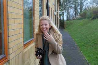
Sasha Clarke from louisereed7
Bibilography for types of photography and why photojournalism is unqiue article.
https://drive.google.com/file/d/0ByPdmPayIEcvdTkzclpjY3d1d2s/view?usp=sharing
https://drive.google.com/file/d/0ByPdmPayIEcvVlVOS3l2ektUWms/view?usp=sharing
https://drive.google.com/file/d/0ByPdmPayIEcvclhhZWs0QVV1bEk/view?usp=sharing


This image does not particularly use the rule of thirds because the subject is not in line with there grid therefore not as effective, however it is still a portrait image. This image uses soft light to make the image look more diffused, gentle and blended instead of intense light.


 The image above shows what my photo looked like before a background was put in place instead of the green background.
I opened the image onto Photoshop that a student took of us stood in front of a green screen. I cropped the side of the photo to get rid of some of the green screen to make the photo look more even and balanced on both sides. I used the magic wand tool and selected all the green background,increasing the tolerance helping pick up more green elements of the photo and deleted it. I then used a camera raw filter to reduce the greens in the hair of the photo and other unwanted colours. I did this by zooming in and changing the thickness of the brush to make a more careful, presence edit.

 Girl Band Magazine Photo
This photo would be for a music magazine, designed for a young audience, with pop music interest. The photo is fun, and uplifting.

This photo of the lockers are a perfect example of pattern and repetition. The lockers are all in a uniform shape (identical) and position so looks aesthetically pleasing. By taking the photo from a front on angle all the elements in the photo are balance and the key hole is slightly to the slide on the rule of thirds which makes it the focal point of the image so draws attention to the key hole showing that the images are of lockers. Also by using the rule of thirds the line through the middle is where the photo dives and looks like repetition enhancing the fact they look the same. Everything in the photo is the same apart from the locker numbers displayed at the top, by displaying something subtly different integers the audience and draws their attention to it, giving them something to look at.


What is meant by the term "Depth of Field?
It is a measure of how much ' depth' of an image will be in focus. An image with a large depth of field will have much more of the image sharp and in focus. Where as an image with a shallow depth of field will only have a part of the image in focus. (Sometimes used to draw attention to parts of the image or make it the focal point.)
What can change the depth of field?


 You can then edit the image by opening it in Photoshop, coming to camera raw filter and play around with the contrasts of the photo to darken the image, and make certain colours in the image stand out.
 This is an example of an image using the same shutter speed and aperture but using different ISO settings. The image becomes clearer as the background gets lighter as the ISO number gets higher. The higher the ISO the more grainy and noisy the image looks.


Bibilography for types of photography and why photojournalism is unqiue article.
https://drive.google.com/file/d/0ByPdmPayIEcvdTkzclpjY3d1d2s/view?usp=sharing
https://drive.google.com/file/d/0ByPdmPayIEcvVlVOS3l2ektUWms/view?usp=sharing
https://drive.google.com/file/d/0ByPdmPayIEcvclhhZWs0QVV1bEk/view?usp=sharing
Rule of Thirds and Composition
Firstly composition the arrangement of elements in a shot which makes the photo more interesting to look at. Focal points are the main points of focus in the photo, they are the bits you want someone to look at (the most interesting points). The rule of thirds is a grid on the camera which looks like a noughts and crosses grid, showing the photo you are taking broken down by 2 horizontal ones and 2 vertical lines into 9 smaller squares. The theory of the Rule of Thirds is if you place the interesting points of your shots at the points where the lines cross or along the lines themselves. By breaking the photo into squares it helps the photo become more balanced and interesting. For example portrait focal points are usually of the yes as thats what you usually look at when you are talking to someone.

This image uses the rule of thirds as the staircase fits perfectly along the line on the photo, the staircase is the main focal point in the photo, the composition of the other elements in the photo are relevant to the whole picture, by showing the surroundings it gives the photo some context as the posters, plant and door balance the rest of the photo to making it more visually appealing and interesting.


The lighting used in this photo is hard light where the colours and features of the subject are more defined and clear.

This image does not particularly use the rule of thirds because the subject is not in line with there grid therefore not as effective, however it is still a portrait image. This image uses soft light to make the image look more diffused, gentle and blended instead of intense light.

The lighting is more diffused and the colours are blended which creates a more natural looking photo. It is also using the rule of thirds as the horizontal and vertical lines divide the picture up into sections are run across the subjects eye line.

 The image above shows what my photo looked like before a background was put in place instead of the green background.
 I opened the image onto Photoshop that a student took of us stood in front of a green screen. I cropped the side of the photo to get rid of some of the green screen to make the photo look more even and balanced on both sides. I used the magic wand tool and selected all the green background,increasing the tolerance helping pick up more green elements of the photo and deleted it. I then used a camera raw filter to reduce the greens in the hair of the photo and other unwanted colours. I did this by zooming in and changing the thickness of the brush to make a more careful, presence edit.


This photo would be for a music magazine, designed for a young audience, with pop music interest. The photo is fun, and uplifting.
Leading Lines, Focal Points and The Rule of Space

This photo of the lockers are a perfect example of pattern and repetition. The lockers are all in a uniform shape (identical) and position so looks aesthetically pleasing. By taking the photo from a front on angle all the elements in the photo are balance and the key hole is slightly to the slide on the rule of thirds which makes it the focal point of the image so draws attention to the key hole showing that the images are of lockers. Also by using the rule of thirds the line through the middle is where the photo dives and looks like repetition enhancing the fact they look the same. Everything in the photo is the same apart from the locker numbers displayed at the top, by displaying something subtly different integers the audience and draws their attention to it, giving them something to look at.

This photo is taken in the library of the book shelf. It is effective using the leading line because it makes the reader follow the shelf right down to the end which draws their attention to the pole at the end which is the subject.The photo is taken from a side angle to that the book shelf is slanted to it looks more interesting and encourages them follow the line.
Aperture
Aperture
What is aperture? The circular hole or opening formed by the black metal blades called the iris diaphragm inside the camera lens through which light passes to expose the sun. The bigger the aperture the more light is let through.
Aperture is measured in F- numbers and dims or brightens images.


What is meant by the term "Depth of Field?
It is a measure of how much ' depth' of an image will be in focus. An image with a large depth of field will have much more of the image sharp and in focus. Where as an image with a shallow depth of field will only have a part of the image in focus. (Sometimes used to draw attention to parts of the image or make it the focal point.)
What can change the depth of field?
- The focal lenth of the lens used
- How near the siubject focussed on is to the camera
- The larger the F number the smaller the aperture but more in focus.
This image used a large depth of field because all of the image is sharp and in focus.  This image has a shallow depth of filed as it is focused and sharp on the leaf and blurry in the background.
 This image has a shallow depth of filed as it is focused and sharp on the leaf and blurry in the background.
Shutter Speed
What is shutter speed? Is a setting on your camera which controls the length of time the shutter is open, allowing light through the lens to the sensor inside your camera. Shutter speeds can go from very small actions of a second to several seconds long on most cameras. Shutter speed in most cameras are measured in seconds or fractions of seconds.
What happens if the shutter is open too long? If too much light gets in and the picture will become over exposed. This means the image is more likely to be blurry; using tripods reduces chances of images being blurry.
What happens if it is not open long enough? The image will be very dark as there's not as much light in the camera and the picture will be underexposed- keep the shutter open for longer.
Examples of using shutter speed

This image is an example of an photo taken with a long shutter speed, which has aloud to much light in causing the photo to be blurry and distorted, also as it was taken with a long shutter speed free hand not using a tripod effects it being blurry.

This are examples of images using a short shutter speed. The mode used was shutter priority controlling the shutter speed, and the camera setting we used was Tv. We controlled the shutter and the camera controlled the aperture.
In evaluation next time we could image the photo by using a tripod to stop our hands shaking when using a long shutter speed so the image isn't blurry and distorted, moreover make sure the room we are in is completely pitch black with no light pollution effecting the photo at all.

 You can then edit the image by opening it in Photoshop, coming to camera raw filter and play around with the contrasts of the photo to darken the image, and make certain colours in the image stand out.
ISO Setting
What is ISO and what is it's range?
When you change your ISO setting, you're adjusting your camera's sensitivity to light. The range of light has a direct relationship with the device's sensitivity, so a lower setting makes it less sensitive and a high setting makes it more sensitive which makes the image brighter. The range is of the setting is is from 100 to about 3200. In low light situation a high 150 would be better such as 1600 however in more light a smaller ISO of 100 for example would be better.
A high ISO setting can make an image grainy and lets lots of light in which could be negative.
Where is the ISO setting located on a camera?
Nicon is located on the shooing menu and on a canon camera there is a button on the back.

This was taken with the 1SO 100 which is why the is so dark not much light is being let in.

This image uses an ISO setting of 400 which is a middle setting which is why the image is relatively clear. This is what it is, why its used and why it works

This image used an ISO setting of 1600 which is why the image is grainy and noisier where the camera is trying to let as much light in the photo as possible.
Photography Assignment 2 - Urban Photography


Contact Sheet Samples


Photography Assignment 2 - Urban Photography
Henri Cartier-Bresson
Henri Cartier-Bresson is a classic example of an
original street photographer.
He was born August 22, 1908 and died August 3,
200.
He was a French humanist photographer considered the master of candid
photography, and an early user of 35 mm film. He helped develop street
photography, and approvingly cited a notion
of the inevitability of a decisive moment.
Cartier-Bresson's
first photojournalist photos to be published came in 1937 when he covered the coronation of King George VI and
Queen Elizabeth,
for the French weekly Regards. He focused on the new monarch's adoring
subjects lining the London streets, and took no pictures of the king.


Nicholas Gooden - Contemporary Street Photographer
- A London based urban / street photographer and micro video content (cinemagraph) creator.
- In 2014 he was included in the global list of the Top 100 Most Socially Influential Photographers and in 2015, the 20 Most Influential Street Photographers.
- He has recently been clients with SkySports, Peugeot,Amazon and Adidas
- Here is a link to his website- http://www.nicholasgooddenphotography.co.uk/london-street-art-and-graffiti-photography/

Here are some other examples of work that have inspired me:


Another street photographer who has inspired me is a man called Dougie Wallace. He has been recognised by The Royal Photographic Society. In my opinion his work is a slightly different type of street photography, who focuses more on street portraiture, being motivated by human behaviour and capturing peoples interactions and emotions naturally rather than them being set up. He also he really interesting editing techniques some are very clear, using earthy colours and others vibrant. His work is informed by today's growing culture of commercialization, and the effect this has on our leisure time and global tourism. His photos convey a personalised point of view that is both believable and absurd.
Here are some examples of his work:


Mood Board

This is a picture of my mood board I created, with all the images I have researched from different photographs and topics which interest me relating to my theme of urban culture. In doing this it has given me inspiration of the sorts of things I would like to recreate, also paying attention to certain colours (brights and vibrant) light (soft or hard) and composition that I would like to use in my photographs.
Proposal - For my photography assignment I have chosen Urban Culture as the theme to base my photographs around because it is the type of photography I am most interested in, going out into real life and taking shots of every day interesting things that have not necessarily been set up; relating back to Henri Cartier-Bresson's "decisive moment" concept. After creating a mood board (shown below) it has given me some inspiration as to the types of urban photos I would like to take. I have decided I am going to go to a variety of locations and take lots of photos of a range of things to do with urban culture. For example I am going to walk around the back streets of Brighton for my graffiti type photos as I know that there is a wide range of graffiti art that is well-known and talked about there. To get transport and other street life related images I am going to go to commercial road in Portsmouth as there is always buses and shoppers walking around, where I could capture something interesting. The last place I am going to go to is ... in .... to get more rural urban looking photographs as they look slightly different and contrast because they aren't in the usual setting but still have an urban, edgy feel to them. I am going to take the photographs by walking around and capturing anything that inspires me and fits into my theme. I have planed destinations where I can take test shots in Brighton where I I know places that are well-known for its creative graffiti that will fit brilliantly fits in with my theme. After my research into urban culture I have an idea in my head off the types of images I would like to take such as graffiti, transport and everyday life events like shopping centres etc.
By planning before I leave for my photo-shoot and planning the sorts of photos I would like to take gives me a rough idea of where to go and increases the chances of me taking an effective photo.
Here are a list of some of the considerations I have made before going out on a photo-shoot:
- Models - If I want to take any photos with models in the background or being the main focus in the street I need to make sure someone is willing to have their photo taken and are in the right place at the right time wearing what I have asked them to wear for the shoot.
- Lighting Lighting determines not only brightness and darkness, but also tone, mood and the atmosphere. Therefore it is necessary to control and manipulate light correctly in order to get the best texture, vibrancy of colour on my subjects. By distributing shadow and highlights accurately, it will create stylised professional looking photographs, also making them look edgy and authentic complying with the urban theme.
- Time of day - Not only does the time of day effect the lighting of my photo, but it makes a difference to how busy it is in the location of where my image is taken. For example if I want to have lots of cars and people in the background of my image the best time to take the photo will be at rush hour to show the level of traffic, or on he the other hand if i want to show a quieter street its better to go either mid afternoon not at rush hour.
- Composition - Everything that I include in my image should play a part, so I am going leave out anything that doesn’t add to its impact and capture elements that add to the image. When considering composition I will make sure that everything in the image is balanced on both sides, I can use the rule of thirds to help me with this.
- Equipment, location and timing - As I will be walking around a lot moving from one place to another looking along the street for inspiration I will be using minimal equipment for the shoot. Where as if I was planning to take photos in a studio it could be filled with high tech equipment to light up the work area and to give
me the flexibility to achieve my goal. It's important to research the area you are intending to use
as a backdrop for your photos. Many of the locations around you might require a
permit to use their premises. Make calls and research. Moreover before going out on a photo shoot it's important to consider the location you would like to take the photos in. Such as is it easy travel to or aloud to take photos of and its crucial to think about whether the location you are taking your photo of has access to natural light if not think about how you could use artificial light to enhance your image. You also have to ensure that the location relates with your idea and your theme. Timing and your
positioning are two big factors and if you choose wisely, you can have dramatic
results even during the mid day. For example if you are aiming for an image looking softer it is better to go photographing either early in the morning or later in the afternoon, when the ambient light is at its softest.
- Battery and memory - I will ensure that before going out on my photo-shoot I will make sure my camera is fully charged with enough battery for the time length of my photo-taking and has enough memory to take lots of photos.
- Weather- Before heading out on my photo-shoot it is important that I check the weather forecast for that day and pre-plan ahead a week or so before leading up to the night before. By checking the weather forecast it means that if it is suppose to rain on the day you are planning on shooting outside then you can chose another day to go rather than waste time trying to take less-effective photos in the rain which could potentially distort the image (unless that's the effect /type of image you are looking in taking).
- Props – Props aren't essential for urban culture and it is more in my opinion about embracing my surroundings and using what's already out in the streets for inspiration. But if I were to use any models in my photos I might consider getting them to hold something if it adds something to the image or a good example is taking a picture of litter for urban culture I might want to put something like that in the shot or I considered taking a picture of a person on a skateboard in a park therefore I would need to make sure they had a skateboard ready for the photo-shoot. I could even create a list of the photos I will be taking will help determine what props are needed.
- Health& Safety- As I have been doing my photoshoot walking around on the streets the health and safety aspect of my planning is slightly different to if I had been taking my shoots in a studio. But having said this here are a list of hazards and solutions that could arise in the setting up of a studio:
- Drop a lense on your foot - Wear sensible shoes to prevent the injury.
- Lots of energy in strobe (lights enough energy to kill - Make sure to read and understand the requirements of lights before I plug or unplug them.
- Over-heating/ catching fire - Don't put flammable things around my lights. Turn off lights when not using them and wear gloves as needed- do not touch the bulbs to prevent burns.
- Trip over cables - Make sure chords and cables lay flat on the ground and don't allow them to curl around in loops. Also tap them to the floor with bright yellow tap so they are visible to myself and others.
- Electrocution (spilling water) - Keep water and liquid substances away from all electricals.
- Always have a fire extinguisher to hand.
Photography Evaluation
For
my assignment I decided to base the theme of my image around urban culture. I
was particularly excited by this theme because it involves going out into
everyday real life and modern culture that is popular amongst young
people. After research into urban
culture and creating a mood board I started to see how much of a broad and
innovative subject it is and that’s where I came across graffiti art. I was
largely inspired by street/graffiti photographer Nicholas Gooden where I have
used some of his work to give me inspiration of how to manipulate colours to
make elements of my photos stand out. The
aim of my photography was to show the artistic side to urban culture and what
it could symbolise. Some of the graffiti images I had come across had an
undiscovered meaning behind them and I wanted to replicate in my image.
In
preparation to the photoshoot there were
some considerations I kept in mind before I set out, such as; the weather (as
rain may distort the image), making sure I was able to get transport to the
location, the time of day, composition and equipment.
In
my research I started to understand that everything in the image has been positioned
in the photo for a reason, which helped me think about the types of elements I
would like to include in my image. I already had a vivid idea of the kind of
graffiti artwork I wanted to take before I left, which was one that gives of a
strong message and symbolises something; still displaying the urban culture theme.
Before
taking my shot I took the composition of elements in my image very seriously. I wanted the colourful graffiti spiralling out
of the subjects’ cheeks to be the main focal point of my image; so I set myself
up in a front facing angle to give that desired effect. Moreover as I’d seen
from previous photographs it looked effective to get other elements from my
surroundings in my shot to add to the urban effect; giving the photo more
context. For example I captured the
pushbike in the corner of the street resting against the lamppost. In doing
this I kept all of the elements in the image balanced by using the rule of
thirds, I took it so that something was always running along one of the main
lines, keeping the image balanced and looking aesthetically pleasing. I took
the image so that you could see windows on both sides of the walls and so there
was no blank space; making the image look more interesting. Before I took the image I ensured I could
capture some of the double yellow road lines running away from the image on the
left side and a road sign. This added to the urban effect showing it was in a
built-up area and uses leading lines as you are wondering what runs on past
them. I took test shots from different
angles, cropping out the sign and bike but it didn’t give the same authentic
feel as when they were in the shot balancing the photo out.
After
the photo-shoot I looked through my shots and chose this one because I thought
there was more behind the image than meets the eye and it was the one that most
my criteria of what I was looking for in
an image. The camera I used was a Canon
7V and I set the ISO to 400 to keep the clarity of the image but still give a
grainy effect and show noise in the background. I set a large depth of field to
keep the image sharp and in focus. In addition I used hard lighting for my
image allowing lots of natural sunlight to show shadows reflecting of the
lamppost; making it more interesting to look at and shows patterns on the
ground as well as walls. By using hard
lighting it also gave a higher contrast emphasising the bright, crisp colours.
I
opened the image up in Photoshop and cropped a woman out in the left corner as she
didn’t add anything to the image and was a distraction. (Original photograph
shown below).

I then
upped the grain and intensity of the image in attempts to give a grittier, edgy
tone. Moreover I increased the saturation and contrast of certain colours being
the pinks, blues, oranges and greens; helping them stand out and draw more attention
to this part of the image as well as adding to the quirky tone. Also I found in my research that graffiti colours
also seem to be vibrant and have an exhilarating feel to them!
As I
wanted my image to represent or mean something I started thinking about the
subjective meaning behind the artwork, the spirals flowing out of her head
could represent the different crazy ideas flowing around in her head
represented by all the different colours and shapes. The artist has clearly
tried to express their feelings about something, maybe they’re trying to
brighten up the streets and make people think more adventurously and evoke
feelings of freedom to think and be who
you are. I printed my photograph in high
quality and 5’7 size, ensuring that the image wasn’t going to be distorted,
squashed or any of it cut out.
In
conclusion overall I am pleased with my final photograph because I produced a
high quality, professional image, using my knowledge of both camera techniques
and pre-production methods (Photoshop) to produce the most effective photo I
can. Furthermore I felt I met my own criteria of what I looked for in an urban
graffiti photo showing emotion through colour and a message. I am happy with my
time management as I ensured I had sufficient time to visit a variety of
locations taking a number of test shots, also giving myself ley-way for any
weather disruptions. After discussing any improvements with my peers next time
I wold try and experiment with a large variety of camera techniques, maybe using
softer lighting and a lower depth of field to see if I preferred the way the
image looks then, similarly I would try taking the photo from a wider variety
of different angles perhaps sitting down and taking it looking up at the
artwork to see if that looks more effective. I also had a member of The Royal
Photographic Society looks at my photo and gave me verbal feedback on how I
could improve it using editing skills such as the filters to make my image look
more effective; which I found incredibly useful. In doing this assessment I
have enhanced my photo taking skills by experimenting with camera techniques
and furthered my Photoshop editing knowledge.
Summary

Imagine walking around the corner of your everyday back
street and coming to face with this, giving you the feeling bewilderment but fascination
of the undiscovered meaning behind the paint. Through this photograph I was
trying to portray street life in in a new light that graffiti isn’t just
meaningless spray paint but in depth and heartfelt artwork. In my photo I
wanted to capture the more symbolic side, one with an undiscovered meaning.
I deliberately composed this photo
forward angle so that the main focal point was the graffiti spiraling out of
the subjects’ cheeks to give a look daring and spontaneous effect. I took the photo in long shot so that I could
capture other elements in the image such as the bike and street sign to emphasis
and add more context to the urban culture theme. I set the ISO to 400 to keep
the clarity of the image but still give a grainy effect and show noise in the
background. I set a large depth of field to keep the whole image sharp and in
focus to give a more open feel. I used hard lighting for my image allowing lots
of natural sunlight to show shadows reflecting of the lamppost; showing patterns
on the ground making it look more adventurous.
By using hard lighting it also gave a higher contrast emphasising the
bright, crisp colours evoking feelings of authenticity and youth. To me this
image gives emotions of freedom and escapism (shown by the explosion of colours
and shapes) from the busy day to day life on the streets that comes with urban
culture, and being seen in a crowd making yourself heard through artwork.
No comments:
Post a Comment