Tuesday, 2 February 2016

Self-directed research Tim Marrs

Rhianna Research
how many abulms has he made/ sold? Titles of album, cd covers, statistics, quotes and song lyrics, concert/tours


Devil in a blue dress- Could construct artwork based around this.                   Anti is Rhianna's latest album - 2016 


Song lyrics - Shine bright like a diamond
The Monster
Four Five Secounds


Tim Marrs Research 
What is his style and what tools and techniques does he use?
Tim Marrs is a graphic designer and illustrator who is best known for his outrageous and striking style of work. He uses a range of techniques such as drawings, photography, screen-printing, Photoshop, hand lettering, graffiti, and draws on American pulp and pop cultures fusing them all together to create a mixed media collage of textured and colourful, digital artwork. This style of hand made work gives a dynamic and contemporary feel. He also uses a digital camera and a scanner to import his sketchbook work into his finished artwork. He seems to be drawn to  
American pop culture featuring stars such as pop singer Rhianna, basketball legend Micheal Jordan and seems to be influenced heavily by pop art in his work (perhaps trying to imitate some of Andy Warhol's pieces)
Tim does mainly promotional artwork and his technique is one of the most influential styles in modern illustration and has attracted commissions from many famous, successful companies such as Pepsi, Nike ( was apart of the Mike campaign) and Virgin helping to advertise and promote their brand and products. His illustration career spanning over 10 years, Marrs is a BA graduate of Humberside University and Master of Arts ( MA) post grad of Central Saint Martins, London. 

What colours does he uses and how successful is it?
The images in his work are very surreal and he uses colours in a bold and strong way to bring this images to life!  The colours are usually bright and ecstatic such as electric blues and vibrant yellow,  this is effective because it readers in attention and curiosity which is especially useful for advertise purposes where you want you to recognise the product. Marrs' uses a variety of subjects in his work from drawing inspiration from day to day images such as road signs, famous buildings, natures and presents them in an abstract and original way. His uses of colour make his artwork dynamic, with a mix of influences from American pop culture, pulp fiction, and pop art. This helps make his work successful because all his work has been carefully thought regarding colour choice, composition and style to create the perfect blend of these features.

Examples of his work 
An example of Tim Marrs work was the promotion of the fast food chain Taco Bell. The poster displays lots of elements associated with Los Angeles, the location of the companies head quarters, including the sun, skateboarding and the Route 66 sign. The reds, oranges (reflecting idea of flames being hot) and yellows used in the design give the feeling of warmth which relates to both the climate where the poster is set and the spicy tacos themselves; it also links in the the strap-line "hot stuff" by using warm colours it links in with the theme. 
The iconic images and themes used give the poster a very familiar feel to it.People which the restaurant is aimed at are going to immediately recognise the famous Hollywood and Route 66 signs, the fun of surfing and skateboarding in summer and going to rock concerts, gives the poster some content and helps bring it to life; making it look exiting and real. These ideas perfectly fit into the strap line "Taste of Youth" as well as the phrase "taste of excitement" featured in the bottom right corner of the poster. The poster's style is similar to a lot of  Marrs' other work, featuring bold composition, vibrant colours and clever imagery. Marrs' poster perfectly fits the exciting and fun theme Taco Bell would have wanted from him, portraying a lifestyle everybody would want to lead.


 This piece Marrs created to promote "Sol Beer". He sticks to the yellow and orange colour theme recognsied by the brand. In 2007, Sol Beer asked him to help push their beer as the "drink for summer". Trying to capture the summer theme Marrs used bright, warm colours of different tones of yellow and orange; linking in with the summery feel. The design captures lots of elements associated with drinking this kind of beer, for example sitting round with your family and friends in the summer having a BBQ drinking a cold bottle of Sol Beer. I think Marrs has demonstrated his skills of drawing, photography, screen-printing, Photoshop, hand lettering in this design. Marrs displays the bottle on the wall of the streets giving it a cool, urban feel. Everything in the design has some form of yellow feature linking in with the brands colour theme, for example yellow cars, shorts,walls, lights, flags etc. Moreover he has used text in his design "Bring on the Sunshine" this is effective because it helps enhance the brands wishes of making it the drinking of the summer and all the yellow summery colours all connect well with the strap-line, also as the writing is in bold, black capitals, it stands out in the design making it the hierarchy of information as it's one of the first thing you look at as it contrasts against all the bright colours in the background. The brand of the beer has been displayed in a creative way being in the centre of the sun at the top of the page; making it the centre of attention (maybe suggesting it's not summer without a Sol Beer?) Although I feel like the hierarchy of information is more focused on the strap-line, therefore I feel the colour of the writing of the brands name needs to be changed in order for it too stand  out more, also the brand of the product gets lost slightly against everything else that's going on in the design; the text should be made slightly bigger to grab more attention.  In my opinion the most successful part of the design is how all the warm colours correlate well together giving a really summery, original feel. 
 

This was designed by Tim Marrs for Pepsi Max. I like this design because it is cool and modern, hitting the youth target market that the product is aimed at. He mainly stuck to the Pepsi themed colours of red, white and blue, incorporating the hue/saturation and stamp effects. Then for the background he has started to use grey and darker shades of blue and black, creating a more urban, edgy, cool look. By using the bright red in the text it makes this the hierarchy of information because it is what we are immediately drawn do which helps promote the brand, and stands out against the darker background. The use of American cars (which are featured heavily in his other work) in this piece portrays a street, slick look, which would appeal to the target audience of 16- 26 year old.
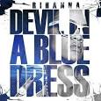
Tim Marrs Rhianna 
Tim has based this piece of artwork around Rhianna. The use of bright  vibrant colours and graffiti style gives the design an urban, edgy feel.  
The use of colours in this deisgn is very reflective of the type of artist Rhianna is and portrays her accurately by the fun colours helping symbolise the pop style of music she releases, but still giving it a unique, quirky edge. This helps the design appeal to a young adult/ teenage audience that Rhianna caters her music towards. The colours Tim uses are bold and in your face, they all contrast each other brilliantly, the light grey background emphasis on the main focus of the design being Rhianna and uses blues and pinks to help her stand out. He has also drawn bright yellow arrows pointing towards Rhianna this is successful as it encourages the reader to look at her. Due to the vibrant, eye-catching colours of Rhianna against the plain background it means she is the hierarchy of information, you can't help but be immediately drawn to this part of the design. The hierarchy of information is in the correct order because the main focus of the design should be around her as it is Rhianna he is trying to promote and make noticeable.  The design has elements of both realism and slightly abstract because she looks like herself with accurate facial features which make it look like a normal photo, but the colours and graffiti style make it seem more abstract and slightly cartoon. 

My opinion on his work and style
I think his style is extremely innovative and exiting. I think his work is interesting because of the huge variety of techniques he uses them and how cleverly he combines them to create something incredibly effective and eye catching.

Thursday, 28 January 2016

Media studies portfolio

Portfolio websites:
Weebly
http://www.weebly.com/uk/
Weekly makes it easy to build a website with multimedia content elements like text, photos and videos which can be added by dragging and dropping them where you want them to go. There are no upgrades or need to install extra things onto you're computers well as being able to sell things off the site you make.
I am attracted to the website Weebly as a possible website that I could use to create my own portfolio because it is a vernal portfolio making website which is beneficial too the type of work I would like to be portraying.
Wix
http://www.wix.com
Six lets you create a website for free, allowing you to choose your own template, customise and publish it. You can upload multi-media elements such as pictures and videos. Weekly and Wiz already come with great, high quality designs that are easy to navigate and set up and you can just customise to suit you and that means you don't have to spend time designing you're own website when they're are brilliant free or cheap templates and designs already available to use and customise. Wix gives 100s of templates, unlimited pages and top grade hosting, free upgrade to premium and get even more. Even though you get a load of features for free such as the photos they also have give users a premium plan offering loads of deals to get the best packet an d more useful features.
This is a screenshot of the Wix website. 
Sqaurespace
Squarespace can create blogs, galleries, online stores; this is beneficial to me because I would be able to upload a variety of multi-media content. It has made sites for brands such as Walk the Moon, V-Magazine, and Target. This site costs $8 for personal use per month billed annually or $12 month to month. This includes 20 pages, galleries, and blogs with unlimited bandwidth and storage, and 2 contributors,  and if you do the annual purchase you also get 24/7 customer support, fully integrated E-commerce, sell 1 product and accept donations and 3% sales transaction free, where as for a business account it costs $18 which offers more including a free domain name.


This is a screenshot of the Sqaurespace website. 

Word Press
WordPress offers everything from simple websites, to blogs, to complex portals and enterprise websites, and even applications, are built with WordPress. WordPress is good for displaying written consent in particular but can still post photos which I feel I would like to show.  It is flexible and easy-to-use.I am going to use WordPress as I feel it is best suited to me because it is free, and it has all the multi-media elements that I will need to use as it is general use which suits my event management use. 

    Tuesday, 26 January 2016

    Book Mark Assignment

    Bookmark Evaluation
    What are CMYK and RGB?
    CMYK is a scheme for combining primary pigments. The C stands for cyan (aqua), M stands for magenta (pink) which darkens and deepens shadows, Y stands for yellow; which flattens an image making it look likes it on more of a greyer scale; opposite to magenta, and K stands for key tone.
    RGB - The RGB colour model is an additive color model in which red, green, and blue light are added together in various ways to reproduce a broad array of colors.

    For my assignment I created a bookmark for the book Billy Elliot. I started off this assignment by drafting different ideas that I could turn into my final design. The bookmark has a silhouette of one ballet arm and leg and one boxing glove hand and boxing boot leg coming out the top of the bookmark which will poke put the book. I feel this is successful as it helps reflect the theme of the book as well as helping bring it too life and make it look more atheistically pleasing and interesting. I chose design three because I felt it was most creative and authentic which would stand out against other bookmarks on the shelf. I decided to use a limited colour plate for my design but the colours I used were bold and bright with a high contrast. I decided it would be most effective to use two main colours; red and black with a hint of grey.  This colour choice was successful for my design because it draws attention to the black silhouette in the background making it stand out and look more effective against the bright, block red front of the bookmark. By sticking too two main colours it looks more professional and less messy also helping the text look more vivid. I used a grey colour on the ballet shoe to emphasise the detail of the ballet laces, using a black colour disguised the shoe laces to much, therefore using grey helped show what the shoe was and helped show the comparison of ballet shoe and boxing boot. 
    With regards to the use of typeface for my design I hand drew the lettering which writes the title “Billy Elliot” a typeface that is similar to ‘Kunstler Script’. I felt by using this type of font for the text reflected the theme of the book well because this style of writing looks fancy and sophisticated, mirroring the writing on a traditional Royal Ballet ticket giving the reader a bit of context of what the book might be about before they read anything. It also gives the bookmark a touch of class and elegance. I chose to just use text on the main front cover of the bookmark, apart from the silhouette coming out the edges of it. I thought this was effective because it helped draw attention to the silhouette and make it look more dramatic and intriguing to the reader. So by keeping the rest of it plain and simple helped emphasised that. The scale of the writing took up most of the bookmark and I centralised the title to reflect that Billy’s feeling had always been pushed to the side and not really thought about, but by the end he is the centre of attention when he takes centre stage, the position of the text reflects this. 
    I feel the hierarchy of information for this design was the text and the silhouette equally because they both use the same tone of black against the red which is an effective contrast so they come as a pair and attract equal attention. But if I had to pick one over the other I would say the text slightly overrides the imagery because it is clear and simple so the reader is automatically drawn to it to see what the book might be about. In my opinion the hierarchy of information for the design is in the correct order because as the reader is drawn to the imagery being the silhouette, it is intriguing and usual so the first thing they see; which makes it successful because  they are more likely to chose a bookmark that looks different.     
    I used a range of tools and techniques for my final design. I started off using pencil and sketching down a few ideas to see what I liked and what best conveyed the boxing/ballet theme. I looked up some examples of fancy writing using the internet for inspiration. Once I had decided on my favourite design I drew a final design and then copied it out onto card, perfecting the design. Once the front cover was done I moved onto designing the back drawing a fancy boarder to reflect the ballet theme. I then went over it using a fine black pen paying attention to any close detail and made some lines thicker around the text so that it stood out and make it more noticeable on a plain background; also it helped show up the detail when I later used digital methods. I then took a photograph of the final design and opened them up into illustrator where I used different filters and white and white effects to make the design look more abstract and eye catching. By using illustrator it enabled me to make my design look more effective as I could block sections of the bookmark and fill it with colour so it was exactly the same and bold e.g. red. 

    To conclude the most successful part of my design was the unique way I portrayed both ballet and boxing on one silhouette to show the conflict between the two hobbies and the problems Billy faces. Moreover I feel the silhouettes arms and legs look like shadows coming out the main body of the bookmark; which will make it more successful and stand out against competing bookmarks as it unusual and intriguing to look at. If I was to do this bookmark again I would either chose one of my other design ideas and use illustrator to see if I can make them look more effective by playing around with different tools. By with regards to alterations to this particular design to make it more successful I would add more detail such as drawings related to the theme of the book e.g coal to represent the miners strike when the book was set. These drawings could go in the main body to break up some of the blank space, although in this instance I think it helps keep the focus on the main part of the design being the silhouette and the text.


    Thursday, 21 January 2016

    Leveson Inquiry

    Leveson Inquiry

    Latest news on the Lord Justice Leveson Inquiry into media ethics and journalism practices following the News of the World phone hacking scandal.
    Lord Justice Leveson's inquiry 'into the culture, practices and ethics of the press' heard from 184 witnesses and accepted 42 written submissions in more than six months of hearings
    The Leveson Inquiry into the culture, practices and ethics of the press was aproached in four Modules. These are:
    • Module 1: The relationship between the press and the public and looks at phone-hacking and other potentially illegal behaviour.
    • Module 2: The relationships between the press and police and the extent to which that has operated in the public interest.
    • Module 3: The relationship between press and politicians.
    • Module 4: Recommendations for a more effective policy and regulation that supports the integrity and freedom of the press while encouraging the highest ethical standards.
    This inquiry also regulates the British press so they cannot for example hack peoples phones like "The News Of The Worlds" did in 2011. 

    The difference between public interest and interest to the public

    In one we give our attention to something because it has the potential to do us good or harm which is publc interest, on the other hand interest to the public is where we are merely curious it is not vital to know it. For example if the police were looking for a murder that was on the lose it would be in the public interest to alert members of the public for their safety, where as interest to the public would be telling them in a gossip manner spreading it round even if it doesn't affect their safety. 


    Wednesday, 6 January 2016

    LAW

    Defamation
    The law of defamation allows individuals, companies, or firms ('claimants') to sue if a statement said about them has the ability to damage their reputation. 

    The relevant law is: The Defamation Act 2013. This law came into force on 1st January replacing the old Act of 1996. It was changed because the large, wide us of social media more and more people became using it so it needed to be clarified. mover another one of the main reasons for the act being changed was because people from other countries were coming over to the UK to sue people for money- but suing them for more money than they would get in their own countries. The new act stops this from happening. 
    Who does defamation affect?

    • Anyone can publish
    • Anyone can sue
    There are two types of defamation:

    • Libel - this covers the written word. This is a more serious case because it is written and have more evidence. 
    • Slander- this covers the spoken word. Slander isthe action or crime of making a false spoken statement damaging to a person's reputation.
    Something is defamatory if it:

    • Lowers them in the estimation of right- thinking members of the public; and or 
    • Causes them to be shunned or avoided; and or
    • Disparages them in their office, trade or profession; and or
    • Exposes them to be hatred ridicule or contempt.
    How much trouble you can get into depends on:

    • The moral or public standing of the person you have made a claim about (how much of a reputation they have to protect).
    • The audience that received the information (how many people read it).
    The person does not need to be actually named to have a case - they can be awarded damage even if they are not named. 

    What are the defences? 

    • Justification - is it true? They have to have been found guilty by a court of law.
    • Fair comment - If it is an opinion or is not intended to be malicious - you have to be careful though as this is a 'grey area'. 
    • Public interest- Anything affecting the rights, health, or finances of the public at large. 
    • Privilege - From official source. There are two types of privilege: Absolute - which covers anything said in court or the House of Commons. Qualified - song information from an official place stat,went - provided it is without malice and in the public interest. 
    Other defences:

    • Website owners are protected- where a comment is posted on their site by someone else. 
    • Scientific and academic journals are also covered (peer reviewed). 

    An example of a recent UK defamation (libel) case:
    Louis Walsh settled his libel action against The Sun out of court for £430,000. The paper had published a story in June 2011 based on a false allegation that Louis had sexually assaulted a man in a Dublin nightclub. The headline 'Louis probed over 'sex attack' on man in loo'. This was damaging for Louis because he has a good reputation with people of the public, therefore it has the ability of lowering him in the estimation of the right thinking public. Potentially if people read this story and believable it to be true it could cause him to be shunned and expose him to be under the risk of hatred ridicule. As it was published as a story from The Sun, a large audience of people would have read it therefore the damage would have been bigger. Moreover potentially because he is on TV shows he could have lost his job on the shows as it may give the show a bad reputation if they hired people thought to have been sexual assaulters. Ut may also prevent him from being contacted onto other shows or jobs in future. But the outcome in the end was that Louis said he was happy to settle out of court and receive an apology. 

    Contempt of court 
    What is contempt of court?
    This law exists to protect the running of the court and give everyone a fair trail.  It is covered by the Contempt of Court Act 1981.There maximum prison sentence in the UK is 2 years but the law is becoming increasing difficult to enforce in a digital media world and will have to be updated to keep up to date with modern media. 
    If you commit a crime - or even if you are accused of a crime you have the right to a fair trail (you are innocent until proven guilty)

    In this country there are two types of law: 

    • Civil and criminal law 

    There is also...

    • Common law is law set by precedent - decisions on previous cases.
    • Statute is written law - decided by legislation


    What could damage the chances of a fair trail?

    • Disrupting court room procedures
    • Prejudicing a trail (influencing the options of those responsible for verdicts such as a jury)
    A jury is 12 member of the public who hear the evidence in a case and decide on a verdict - guilty/ not guilty. 

    What are the main stages of active proceedings?  Crime

    • Arrest
    • Charge
    • Trial- Magistrates then Crown
    • Jury deliberations
    • Verdict 
    • Sentebce or acquittal 

    How is contempt deter